Freeletics data export and visualization
When the pandemic started and all gyms closed in Germany, I was looking for alternatives to stay in shape. I tried the Freeletics app which stuck with me and I’ve used it on a regular basis ever since. The app offers - apart from paid plans - free high intensity workouts based on body weight and repetitions. I train my core and lower body with a workout called Athena that consists of climbers, sit-ups and squats. A timer tracks if you completed the workout faster or slower compared to your personal best time and you can also rate your technique.
After two years using the Freeletics I wanted to visualize my training progress. The app doesn’t give you any graphs or statistics, so I decided to request an export of my data to do it myself. Luckily, the General Data Protection Regulation (GDPR) gives users the right to request a copy of data that is being stored about them. In the Freeletics app you can initiate such a request by going to “Settings” -> “Privacy” -> “Data Export”.
Within 24 hours I got a copy of my data.
The ZIP archive contains your profile picture (if you uploaded any) and a text_data.yml file that contains profile data such as height, weight, gender and workout data.
---
training:
  trainings:
  - workout: Athena standard 5
    performed_at: 2022-04-25 04:47:46.448000000 Z
    star: true
    time: '00:06:38'
    repetitions: 225
    [...]
During the workout, you tap on the screen to indicate that you finished the current routine and continue with the next. Then you can see if you are ahead or behind your best time. This data is somehow missing from the data export. You just get the overall workout time.
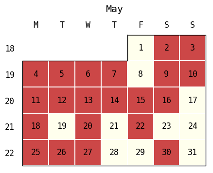
To visualize my training frequency I used PyYAML with July (via) to plot a calendar heatmap of my workouts:
import july
import matplotlib.pyplot as plt
import numpy as np
import yaml

with open('text_data.yml', 'r') as stream:
    try:
        data = yaml.safe_load(stream)
        print('Total workouts:', len(data['training']['trainings']))
        performed_at = sorted([training['performed_at'] for training in data['training']['trainings']])
        performed_at_data_points = np.ones_like(performed_at)

        #Plot all workouts
        july.calendar_plot(performed_at, performed_at_data_points)

        #Plot single month
        july.month_plot(performed_at, performed_at_data_points, date_label=True, year=2020, month=5)

    except yaml.YAMLError as exc:
        print(exc)
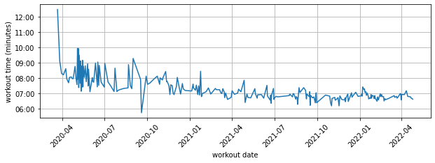
I also plotted how my workout time improved over two years:
performed_at = [training['performed_at'] for training in data['training']['trainings']]
synthetic_day = datetime.date(2030, 1, 1) #matplotlib workaround
time = [datetime.datetime.combine(synthetic_day, datetime.datetime.strptime(training['time'], '%H:%M:%S').time()) for training in data['training']['trainings']]

dtFmt = mdates.DateFormatter('%M:%S')
plt.gca().yaxis.set_major_formatter(dtFmt)
plt.xticks(rotation=45)
plt.xlabel('workout date')
plt.ylabel('workout time (minutes)')
plt.grid(True)
plt.plot(performed_at, time)